
Originally printed in the August 2018 issue of Produce Business.
Protect the produce but send a message, too.
Concerns about food safety, traceability and shrink figure to continue the trend toward an ever-increasing number of packaged products in produce. But as they protect the food, these packages also serve as a canvas to deliver messages about the product and brand.
 “Any artwork on a label or directly printed on the material is an opportunity to communicate brand identity,” says Sara Lozano, marketing manager at Sambrailo Packaging, Watsonville, CA. “The structural design of the packaging a brand selects equally supports the brand.”
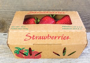
Sambrailo supplies many of the packages used to display the strawberries, blackberries, and raspberries from the nearby Pajaro and Salinas Valleys, and recently augmented its product list with its line of Readycycle plant-based containers that deliver a message of sustainability.
 Labels well done also can play an important role in drawing the attention of consumers and increasing sales.
“Brighter packaging with a clean look tends to get picked up more than something that is generic,” says Jeff Watkin, graphics and marketing manager at Sev-Rend, Collinsville, IL. “If you’ve got some branding in place, you want to consistently use colors and graphics that are consistent with that.”
Sev-Rend produces bags, tags, labels and flexible packaging that offer a view of the product and also afford space for graphically pleasing messages.
Catch the Eye, Close the Deal
A package with graphics done well can be the first step in getting the consumer to at least consider making a purchase.
“The brand and a print with beautiful graphics are important,” says Hans Schur, chief executive of Schur Star Systems, Carlsbad, CA. “Consistency of the graphics is important. There’s a bunch of companies that are doing a terrific job of messaging.”
Schur Systems is a sixth-generation family company, started by Johan Wilhelm Schur in Denmark in 1846, that provides packaging, packaging machines, and packaging systems.
Although pouches are commonly used for juices, Schur is among a few companies using the rounded Doy-style stand-up pouch for fruits and vegetables.
“Shelf visibility is important,” says Schur. “Try to be creative with the shape, material and graphics on the package.”
Graphics frequently are designed to appeal to a particular age group of consumers.
“If you go into a retail store, you can find very juvenile as well as adult-themed presentations, especially on those items targeted at a specific buying audience,” says Joe Bradford, vice president of sales at Temkin International, Payson, UT. “In years’ past, we mainly saw a consistent look for a brand regardless of product. Now we see brands that target children, teens, as well as adults. We are seeing the produce industry learn from the cereal, confectionery and snack-food segments. Look at what they have done and the way they market to a specific buying audience. Produce is taking a step in that same direction.”
Temkin produces flexible and rigid plastic packages in many shapes and styles, with the capacity to use brilliant, eye-catching graphics.
“The push for branding and marketing has been more evident in the past few years than ever before,” says Bradford. “Look at what the industry has done with the assistance of licensing agreements with companies such as Sesame Street. We market to specific age groups. We have seen a significant increase in target marketing.”
Other packaging specialists also have noticed that more graphics familiar to children are migrating into produce as young parents look to encourage their children to eat healthy.
 “One thing I notice with produce is the packaging is geared toward young families with kids,” says Watkin. “One example recently is the Eat Brighter! campaign in conjunction with Sesame Street. You have Big Bird, Elmo, the Cookie Monster on the package trying to get children to eat fruits and vegetables when they are young.”
The Message
Although the first test of the package’s message is whether it catches the eye, for some consumers more detailed information matters.
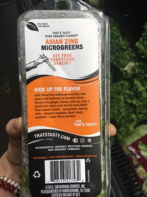
“Consumers always want more information,” says Kristin Yerecic, marketing manager at Yerecic Label Co., New Kensington, PA. “We have found a multilayer label helps to communicate the grower’s story or an idea to utilize the product in a recipe. Many times, the messaging shifts over time to focus on the items consumers are interested in. For example, vitamin, protein and antioxidant callouts are very popular right now with the focus on health.”
Yerecic produces labels that include information modern consumers expect.
“In terms of claims or statements, organic, fair wage and value-added items resonate stronger with Millennials,” says Yerecic. “Boomers are drawn to nutrition and locally grown callouts. Millennials are also much more interested in digital resources such as a QR code to a Hands & Pans video or an Augmented Reality platform. Millennials are also more interested in the product and grower information.”
One way to look at the shape of the package is how much room it allows for visual and printed information.
“The more real estate on the packaging, the better,” says Watkin. “Information about where it came from and ways to use it are beneficial.”
Sometimes the material used in the package conveys a subliminal message about the company and the product.
“Paper laminate gives the package an earthy feel,” says Schur. “It gives it a more organic feel on the shelf. There are a lot of opportunities in the way of printing on paper laminate.”
The Sambrailo paper-based packages, are designed to give organic consumers in particular an earth-friendly feel.
“We invite produce companies to think of ways to communicate their message via packaging,” says Bradford. “We invite produce companies to challenge packaging producers to come up with solutions to your marketing ideas. Be innovative. Be a leader in the industry.”
Consistency Matters
 The look of the package should become familiar over time because it conveys a trusted brand. “Aesthetics and the way a package presents to the consumer is generally consistent with a brand,” says Bradford. “While we see little to no change in logos and the attempt to maintain brand recognition, the font, images, colors, etc., are targeted to the buying audience and the product.”
In order to build long-term brand identity, the look of the package should be consistent with the graphics on the company’s other messaging.
“Labels should always complement the brand’s packaging and other marketing materials,” says Yerecic. “Many times, we do label mock-ups on the clamshell or finished package, so the customer can see how the label design complements or takes away from the product. This is even more important in produce as visibility of the product is one of the top customer desires. We have seen many clear labels or labels with viewing windows in produce to promote visibility of the product.”
Graphics and the feel of the package play an important role in helping to build trust.
 “Consistency and authenticity are two aspects my customers often communicate,” says Lozano. “They want to have their customers recognize them, and they want to also have their creativity reflect who their company is and what they represent.”
The look of the package is an important part of building a long-term relationship with consumers.
“The most interesting thing about labeling and packaging is that this is your opportunity to create long-term communication with the customer,” says Yerecic. “The package and label will exist in the consumers’ kitchen much longer than any print ad or commercial, so we always encourage customers to make the most of this opportunity to communicate your story to the customer.”
What Cost Messaging?
The use of the most effective, high-powered graphics can affect the overall price of the packaging.
“Cost in packaging is based on material, labor and machinery costs,” says Bradford. “We have seen an increase in matte overprint, an increase in special converting styles, shapes and value-added packaging. The cost to differentiate at times can be minimal and at times can be a larger investment. It all depends on how radical the concept and design is. In the end, we have found there are companies that invest in marketing and are leaders in the industry, and there are followers. The leaders seem to constantly reinvent themselves and their brand, staying on the forefront of consumer demand.”
The price for packaging can be broken down into the components that make for the shape and graphics.
“The costs for labels can vary dependent on the label size, shape, material needed (paper or film), number of colors utilized, etc.,” says Yerecic. “Another factor on the pricing on the label is whether the label is multilayer or single layer.”
Finances and size of the producer have an impact on the packaging and graphics that make most sense.
“The image shape, font, colors, and graphics vary based on the company’s resources,” says Yerecic. “Yerecic Label offers graphic artists to build a label design at no cost, but some companies utilize outside agencies or their own marketing department to create the label. Many times, the colors, fonts and graphics are chosen based on the organizations’ existing branding and brand story. For example, if a tomato grower-shipper wants to build a label for a new product, we would reference existing designs to stay consistent with their brand; or if they are looking for a completely new look, we would reference consumer research and brand information to develop an eye-appealing label.”
Sometimes, it is the brand that impacts cost more than the graphics and information on the packaging.
“The brand affects the price more than the messaging,” says Sev-Rend’s Watkin. “A known brand would impact the price more.”
Some messaging on the package comes at a cost, while other information can be relayed free of charge.
“Adding unique callouts to a label or package such as, ‘Great source of vitamin C,’ would not change any costs for labeling,” says Yerecic. “However, if a company wanted to use USDA-organic or Fair Wage logos, there is most likely a fee/process through those organizations.”


